Colour Wheels - How to Mix Colour
COLOUR THEORY
Color is a language of its own, capable of evoking emotions, setting moods, and telling stories without words. In the world of scrapbooking and mixed media projects, mastering the art of color can elevate your creations to new heights. One essential tool to help you do just that is the color wheel. In this guide, we'll explore the fascinating world of color wheels and how to use them to enhance your scrapbooking and mixed-media projects.
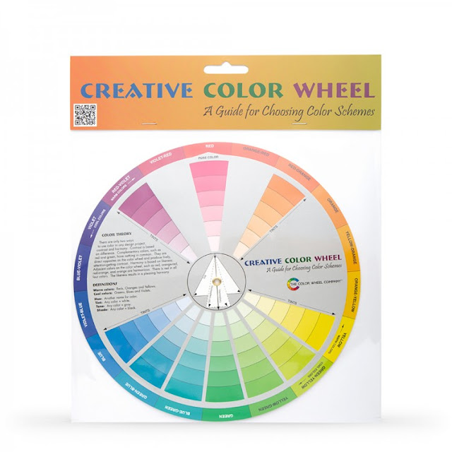
Colors that look good together are called 'colour harmony'. Artists and designers use these to create a particular look or feel. You can use a color wheel to find color harmonies by using the rules of color combinations. By applying these rules you won't end up with muddy colours when using inks, paints, and sprays.
Understanding the Color Wheel
Before we dive into practical applications, let's get acquainted with the color wheel. The color wheel is a visual representation of the colors in a circular arrangement. It's divided into three primary categories:
Primary Colors:
These are the foundation of all colors and cannot be created by mixing other colors. In traditional color theory, the primary colors are red, blue, and yellow.
Secondary Colors:
These result from mixing two primary colors together. The secondary colors are orange (red + yellow), green (yellow + blue), and purple (blue + red).
Tertiary Colors:
These are formed by mixing a primary color with an adjacent secondary color. Tertiary colors include shades like red-orange, yellow-green, and blue-purple.
Using the Color Wheel in Scrapbooking:
1. Color Harmony Selection.
The color wheel is your go-to tool for choosing harmonious color combinations. Here are a few common schemes:
- Analogous Colors: Select colors that are adjacent to each other on the color wheel. This creates a harmonious and serene look for your scrapbooking layout.
- Complementary Colors: Choose colors that are directly across from each other on the color wheel (e.g., red and green). Complementary colors create a striking contrast and make elements pop.
Triadic Colors: Pick three evenly spaced colors on the color wheel (e.g., red, blue, and yellow). This creates a balanced and visually appealing palette.
2. Setting the Mood
Colors can convey emotions and set the mood of your scrapbooking project. For example:
- Use warm colors (reds, oranges, yellows) for a cheerful and energetic vibe.
- Cool colors (blues, greens, purples) create a calming and tranquil atmosphere.
- Earth tones (browns, greens) evoke a natural and rustic feel.
- Consider the emotions you want to convey and choose your color scheme accordingly.
3. Emphasizing Focal Points
Using the color wheel, you can draw attention to specific elements in your scrapbook. Use complementary or contrasting colors to make the focal point stand out. For instance, if your background is mostly cool blues and greens, a splash of warm red can create a captivating focal point.
Incorporating the Color Wheel in Mixed Media Projects
Mixed media art allows for even more creative freedom with color. Here's how the color wheel can enhance your mixed media endeavors:
1. Layering and Blending
Experiment with layering and blending colors to create unique textures and hues. Start with a base color and gradually add complementary or analogous colors to build depth and complexity in your artwork.
2. Color Washes and Gradients
For stunning backgrounds, use color washes and gradients. Begin with a light color and gradually transition to darker shades. The color wheel helps you choose harmonious colors for seamless transitions.
3. Color Contrast
Mixed media often involves incorporating various materials like papers, fabrics, and found objects. The color wheel can guide you in choosing materials that complement or contrast with your chosen color palette, adding dimension to your artwork.
Conclusion
In scrapbooking and mixed media projects, the color wheel is your trusty companion, guiding you through the intricate world of color. Whether you're aiming for harmony, contrast, or emotional resonance, understanding and applying color theory principles can take your creations to the next level. So, let your creativity flow and paint your stories with the vibrant hues of the color wheel. Your scrapbooks and mixed media art will be richer and more expressive than ever before!


No comments