Scrapbooking Sketches - The Ultimate Guide
Scrapbooking sketches are a great way to quickly design beautiful layouts for your scrapbooks! This blog post will endeavor to show you how to choose the right sketches, use them to create meaningful stories, and craft stunning masterpieces. Get ready to make amazing layouts with scrapbooking sketches!
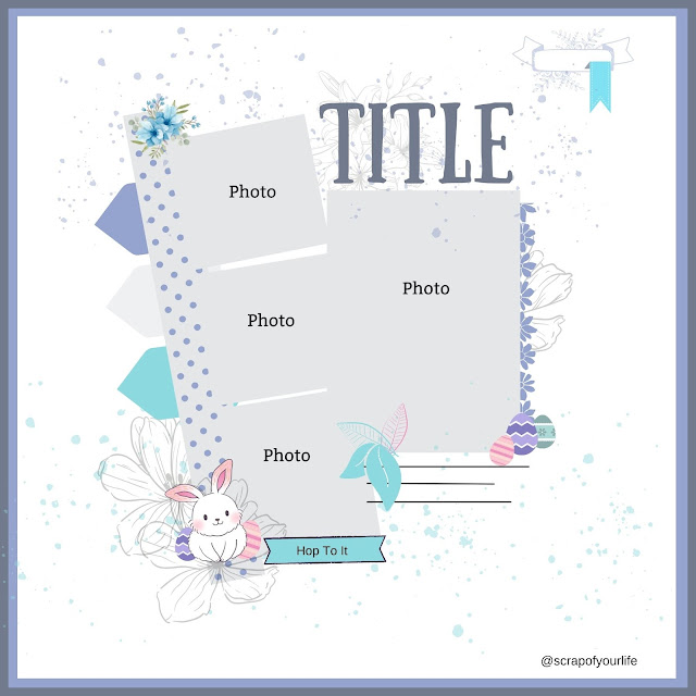
Scrapbooking sketches are like house plans. They can either be hand drawn or created digitally and the aim is to help plan your layouts.
A sketch is designed to show you where to position photos, titles, journaling, and embellishments and it gives novice scrapbookers somewhere to begin if they are not experienced with balancing the layout correctly. Scrapbookers can interpret the sketch in any way they choose; it is a great starting point when you have a scrappers-block.
What are Scrapbooking Sketches?
Scrapbooking sketches are simple designs or templates that offer guidance on how to lay out your page or project. They can be used as a starting point for creativity, helping you decide where each element should go and giving ideas on how they should all look together when complete. Sketches can be found online and in magazines, providing inspiration and practical instructions so that you don’t have to start from scratch.
Assembling the Sketch Design
Once you’ve chosen a sketch, it’s time to get started assembling the design. With scrapbook paper or patterned cardstock, cut out shapes that relate to each element of the design. For example, if your sketch has a circle element, simply trim a piece of cardstock or paper into the shape of a circle. Lay the pieces across the page in roughly the same placement as they are in the sketch and then tape them down at strategic points. This will give you a good visual overview of how all elements should be placed together when it comes time to adhere permanently to your page.Developing Your Theme and Color Scheme
Once you have your scrapbook sketch design together and all of the pieces are cut out, it’s time to think about the larger theme and color scheme of your project. Consider adding patterned paper strips to give your layout an interesting background or choosing complementary colors to add depth and texture to your design. Using some embellishments can help draw attention to particular elements in the sketch such as a journaling spot or a title space. Experiment with different combinations until you find one that compliments both the scrapbook page theme and overall design.
Adding Stickers, Embellishments, and More
Finishing up a scrapbooking sketch is easy with the right accessories. You can add pieces of paper, embellishments, stickers, brads, ribbons and buttons to extra decoration and depth. Try different shapes and colors to add contrast - use square stickers in one corner and round ones in another; focus on circular shapes around a title; or match colors with the patterned paper backing. Once you’ve applied your accessories, you're days away from a great scrapbook layout!
Finishing Touches with Titles and Journalling
After you’ve finished your scrapbooking sketch, why not add titles and journaling to tell the story behind the layout? Titles can be handwritten or computer-printed to match your theme. They can even be cut-outs from a magazine or catalogue. If your layouts are about someone or something special, consider adding journaling to capture those memories in words. You could include quotes, information about days out, special events, and anything else meaningful!
Scrapbooking Sketches A Few Tips:
Using an odd number of embellishments or photos creates a better visual impact on your pages and draws the eye to the whole page as well as gives your layout a more finished look. (sets of 3's, 5's and 7's are most common for embellishment numbers).
Creating layers on your pages will not only help bring colors and patterns together, but it will create a border and give your page a textured effect. The alignment and placement of everything on your page should have a visual connection. This means that you shouldn't place things so far away from the focal point of your page that it doesn't connect in some way.
Likewise, items relating to each other should be placed close together so they become one visual unit rather than several separate units.
So there you go! I hope this has helped you understand a little bit more about Sketches and how they can be your go-to when you're stuck on designing a layout.
If you would like to see sketches, mood boards and printables visit the Scrap of Your Life website FREE printable page.


.png)


No comments